While PPC marketers are focused on testing ad copy and what keywords to target, optimizing landing pages can be an afterthought. This is a missed opportunity, especially given that users visit your landing page once you have already paid for their click.
You want to be leaving as little money on the table as possible once a visitor is on your page. To help make this a reality, Oli Graham, Marketing Manager at RightlyWritten discusses the most important elements of landing page copy that you should split test.
Quick links
Achieving the balance between modular testing and congruence
Page title
Your landing page’s headline is the first element that can cause friction between your user and conversion goals.
How much friction? Well, a study from Copyblogger suggests that only 20% of people read on from a page’s headline.
This suggests that most people get page titles wrong and that standard convention in what makes a headline “work” can’t always be trusted.
With page titles performing so poorly, often even when best practices are followed, testing is the only way forward.
When testing headlines and page titles, there are two variables that you want to test. These are:
- The headline “angle”: What is the message in your headline
- The headline “formula”: How this message is conveyed
It’s better to test these two factors in isolation, first find a winning angle, and then find the best way to phrase it.
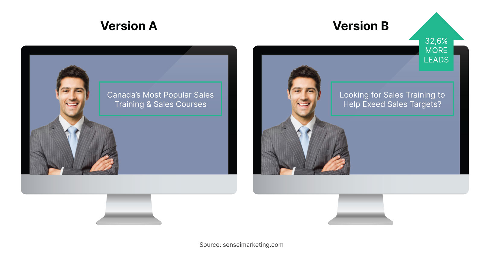
Looking at how different headline “angles” can affect the conversion rate of a landing page, let’s compare two titles of landing pages that are trying to sell an online training course.
The two headlines are:
“Canada’s Most Popular Sales Training and Sales Courses”
And
“Looking for Sales Training to Help Exceed Sales Targets?”
Here, the first “angle” of the headline revolves around social proof. The quality of the course is demonstrated through its popularity.
The second headline “angle” revolves around its benefits – the course purports to help its users increase sales.
In this instance, the second headline angle converted better by 32.6%. As an advertiser, you now know that your audience is more persuaded by your product’s potential benefits than by the “social proof” of your popularity.
Once you have found your winning headline angle, you can start testing different ways to formulate that angle.
A natural progression of the above test would be to test the two headlines:
- “Looking for Sales Training to Help Exceed Sales Targets?”
- “Increase your Bottom Line by 47% with our Sales Training.”
Both headlines espouse the benefits of the product being sold, but they are expressed in different ways. Winning headlines consider an audience’s preferred angle and wording, so both should be tested for optimal results.
Call to action (CTA)
A landing page needs one clearly defined call to action that leaves the user assured how he should interact with a page.
There are three variables that you need to think about with your call to action. These are:
- The design and placement of your CTA button
- The call to action itself
- How your call to action is worded and phrased
While all elements are important and should be tested, tweaking the wording of your call to action can be one of the best “quick-wins” to increase your ROAS.
An example of just how big of an impact a small tweak to your CTA can make is shown through a study by ContentVerve who found that changing their call to action from “Start Your 30 Day Trial” to “Start My 30 Day Trial” increased the landing page’s conversion rate by 90%.
Although testing and reviewing is the only way to definitively know what the optimal landing page copy is for your page, here are a few best practices to give you an idea of what to test:
- Use the first person: Compare “Start My Free Trial” to “Start Your Free Trial.”
- Be concise: 2-5 words is ideal for a call to action.
- Use a specific timeframe: Suffixing your call to action with time-sensitive language like “Today” and “Now” can create a sense of urgency in your user.
- Use a pattern interrupt: We’ve seen pattern interrupts like “Click here to buy” thousands of times before. Use conversational or even humorous language to overcome banner blindness.
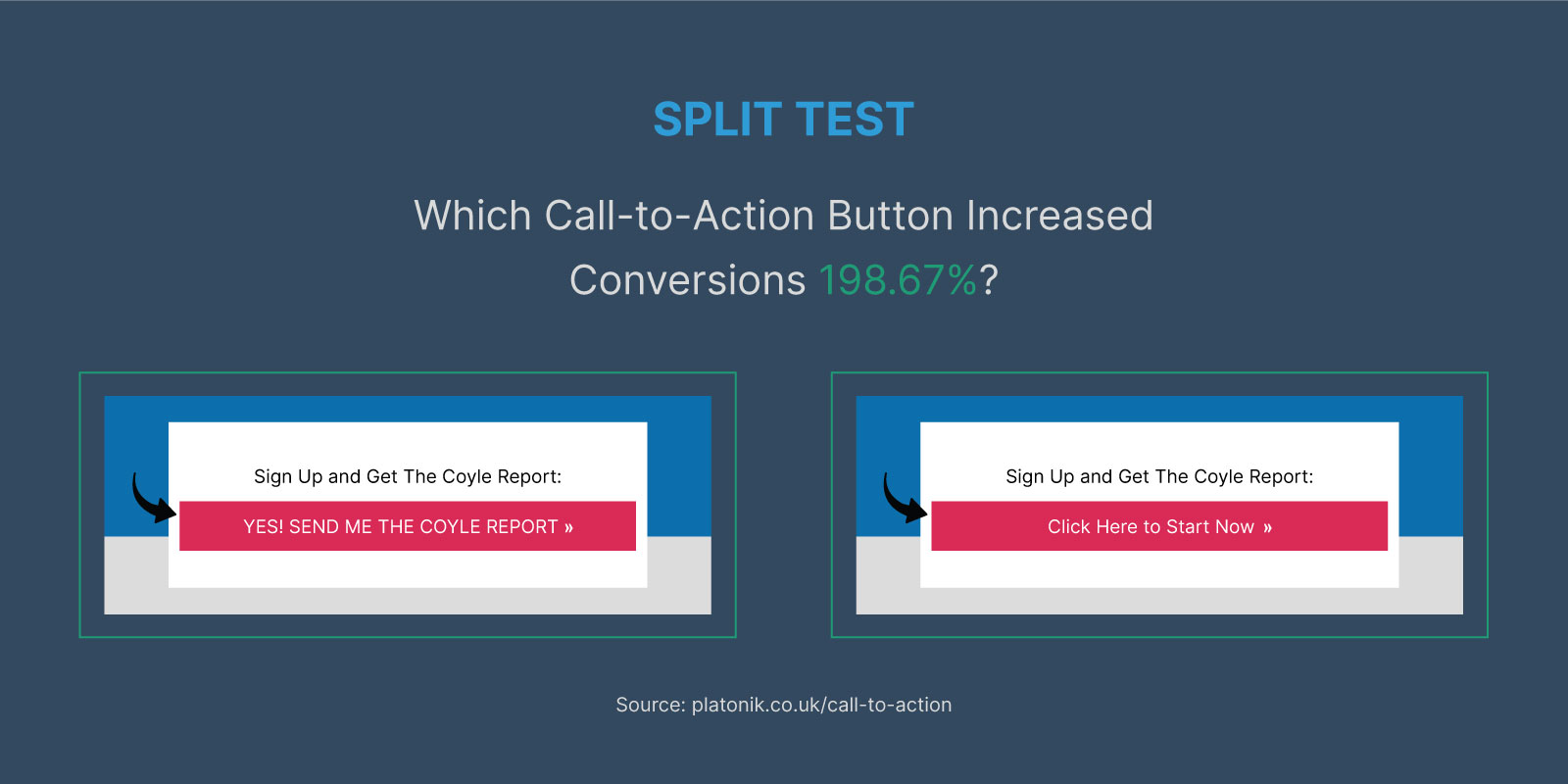
In the example below, you can see the use of pattern interrupts in the call to action:
The use of unusually informal language and caps in the above example almost tripled conversion rates.
Given the simplicity of a call to action, it is easy to get super-granular with your testing. Tweaking and testing each word of your call-to-action copy can hone what elements are driving conversions.
With the above example, we could use further testing to tease out whether caps or informal language boosted conversions. Once we know what is making our visitors convert, we can double down on these elements.
Benefits of product
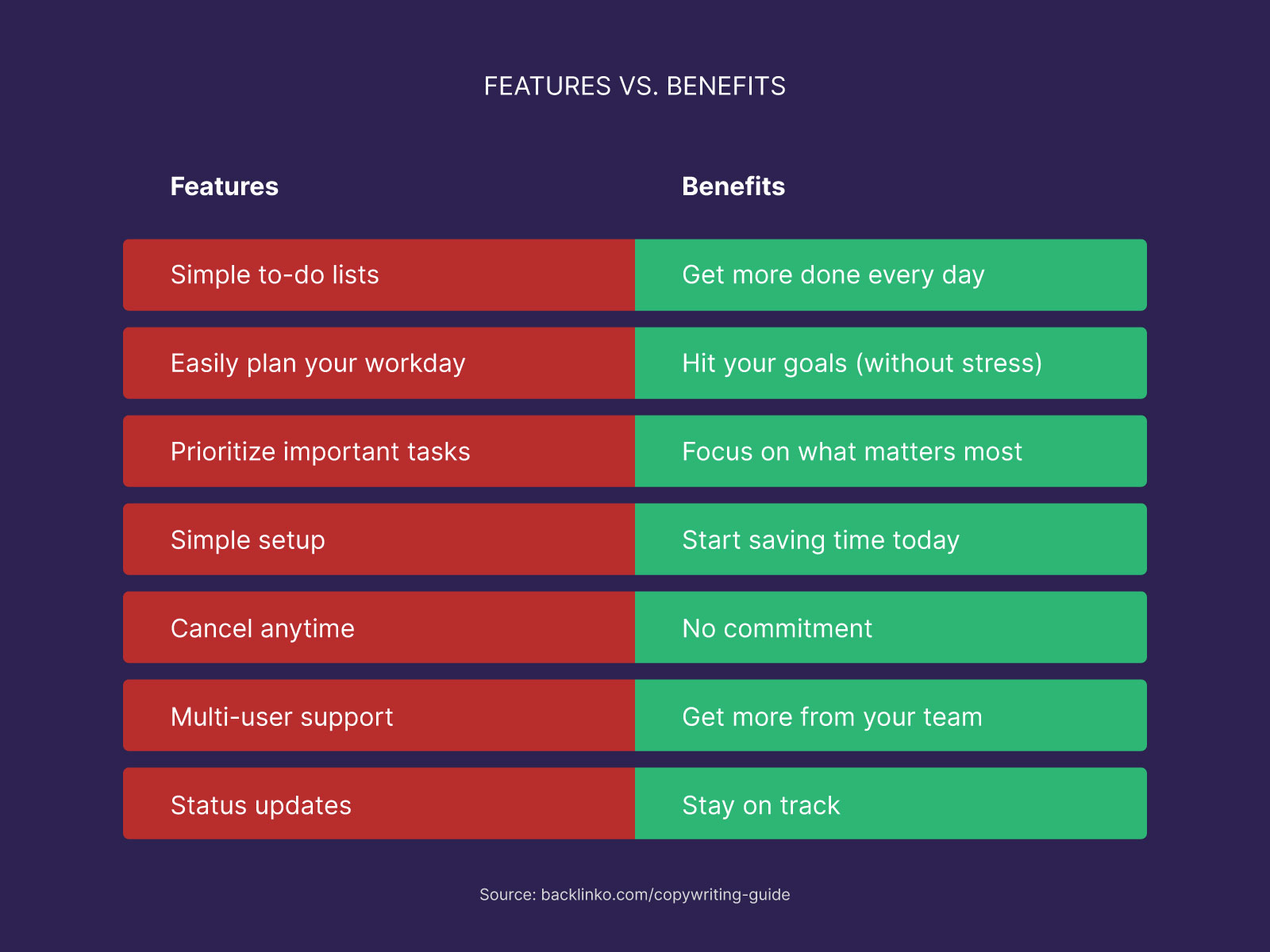
It’s copywriting best practice to talk about your product’s benefits, as opposed to its features.
To highlight the difference between benefits and features, let’s use PromoNavi’s PPC tools as an example.
Two features of the tools are that they can perform competitor analysis and automate reporting. These are the qualities of the tools of themselves.
The benefits are what users gain from using the tool. For PromoNavi users, the benefits are saving time and increasing ROAS through having better performing ads.
What we should notice here is that most products have more than one benefit. Therefore, you can write different versions of your landing pages that each emphasizes a specific benefit and then test these versions against each other.
With Google Ads campaigns, you will likely get the best results by having your ad copy and landing page copy written congruently around a specific benefit of what you’re offering. This congruency should extend to the keyword you are targeting with your ads.
For PromoNavi, an example of this would be targeting keywords around automation (for example, PPC automation tools) with ad and landing page copy that focuses on the benefits of saving a user time.
You can then test specific benefits against each other on a campaign level to find out what specific benefits of your product potential customers care most about.
Social proof
There should always be social proof available to people who click on your adverts, but the question is how do you deliver this to them in a way that reduces friction.
While your page should be uncluttered as possible above the fold – just a headline, hero image, and call to action will do.
Social proof can do the job of convincing undecided users who scroll below the fold of your value proposition.
Social proof can be presented in a number of different ways, and the way you present this can impact your conversions.
Three ways that you can present social proof on a landing page include:
- Written testimonials
- Graphs and other visual data presenting the results of past users
- Video testimonials
- Celebrity endorsements
If you include written testimonials on your landing page, one test that is immediately worth running is to add photos of your customers next to the testimonial vs having the testimonial alone.
Psychological research suggests that the presence of images increases the believability of otherwise unverified claims. Logic follows that testimonials with a visual component may be more powerful than ones without.
How to Drive More Google Ads Clicks: 3 Fully Automated Tools
Achieving the balance between modular testing and congruence
The key to running worthwhile split tests is to break down your landing page into individual elements and make sure that you only test one element at a time.
The smaller the differences between the “A” and “B” samples in your test, the better informed you can become on what copy elements make your landing pages convert and what do not.
A potential problem that can occur when people take a very “modular” approach to A/B testing is that they fall into the temptation of simply putting together all the top-performing elements and creating a landing page that is not internally congruent, and which is inconsistent with the messaging in your advert.
This can lead to campaigns becoming less than the sum of their parts.
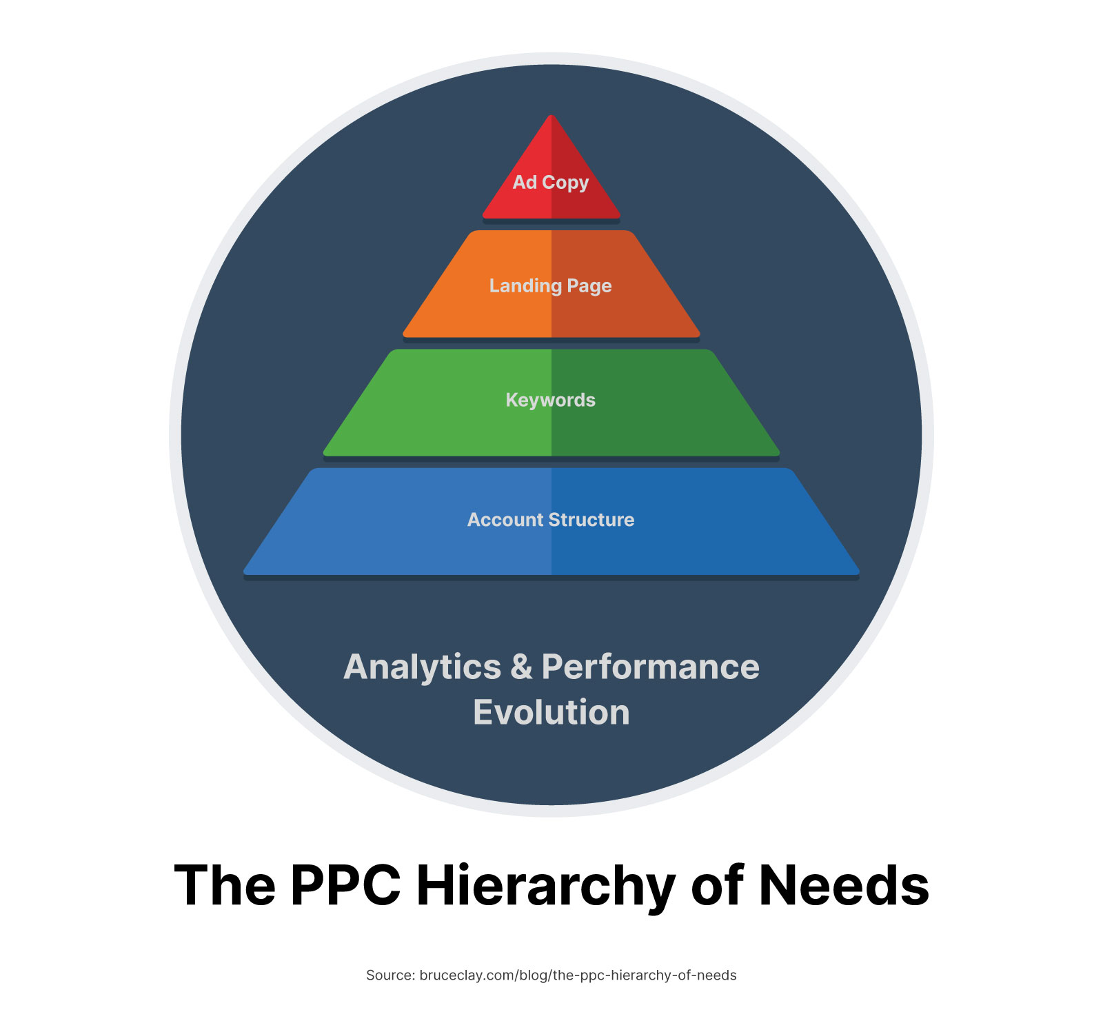
To avoid this, you should prioritize getting your overall PPC strategy and marketing funnel as optimized as possible before testing “shallower” features such as copy and design.
Once your overall strategy and funnel are determined, you can only test copy and design elements that make sense in your strategy’s wider context.
This will save you money by avoiding pointless tests and making sure that you do not lose overall congruence in your marketing funnel.
Read PromoNavi’s guide on how to avoid inappropriate and ineffective budget spending.
Wrapping up
Optimizing your landing pages through split testing copy elements will help you get the biggest ROI on your PPC campaigns.
When testing your landing pages, you should focus on the four most impactful elements of your landing page copy.
These are:
- Your page’s title
- Your call to action
- The benefits that you choose to emphasize
- How you present your social proof
Focussing on testing these elements will see you only spending money on tests and optimizations that will increase your bottom line.
Do you want to boost your Google Ads efficiency? Link your accounts to PromoNavi to automate everyday tasks and receive valuable recommendations on how to improve your campaigns. Keyword research, competitor analysis, automated reporting, analytics dashboard, and other tools are available in PromoNavi.
