Just a few years ago digital marketers would spend a lot of time exporting, filtering and formatting data in Excel. But, fortunately, those days are long gone thanks to Google Data Studio. Google’s Data Studio makes every bit of data useful, enabling a much easier access and sharing of reports.
What is Google Data Studio?
Google Data Studio is a web-based data visualization tool that helps users build customized dashboards and easy-to-understand reports. It helps track key KPIs for customers by visualizing trends, and comparing performances over time. Google Data Studio is easy to use, with just a few clicks needed to build a table or graph. However, its functional simplicity does not detract from its value , because it covers most of the tasks that an advertising specialist has to deal with daily.
Google Data Studio and its main competitor
Google Data Studio’s main competitor on the market is the Power BI platform, developed by Microsoft. We will now look at the main differences between these products and explain some of them in more detail.
1. Google Data Studio is a web service that is created and edited in the cloud. Power BI has a software part – a desktop application in which you can create and design a report and then publish it with access by a link. Alternatively, you can save reports to a file that can only be opened through the PBI program. And Let’s make it clear from the get-go: we are only looking at the free version of Power BI.
2. Google Data Studio is available in any browser. Power BI is designed to work with Windows, so when designing reports on other operating systems, difficulties may arise.
3. Any Gmail mail is enough to register Google Data Studio, which makes the service a more versatile tool – it can be used not only by agency employees, but also by freelancers.
4. Google Data Studio is exclusively a visualization tool. Unlike Power BI, it does not have any advanced tools for integrating data and metrics, analytics or the option to predict results. But we love it for its simple and user-friendly interface.
5. Interactive sharing in Google Data Studio implies the possibility of collective data editing in the cloud. The free version of Power BI does not provide such features: the report is available via a public link, but that’s it.
What opportunities Google Data Studio offers:
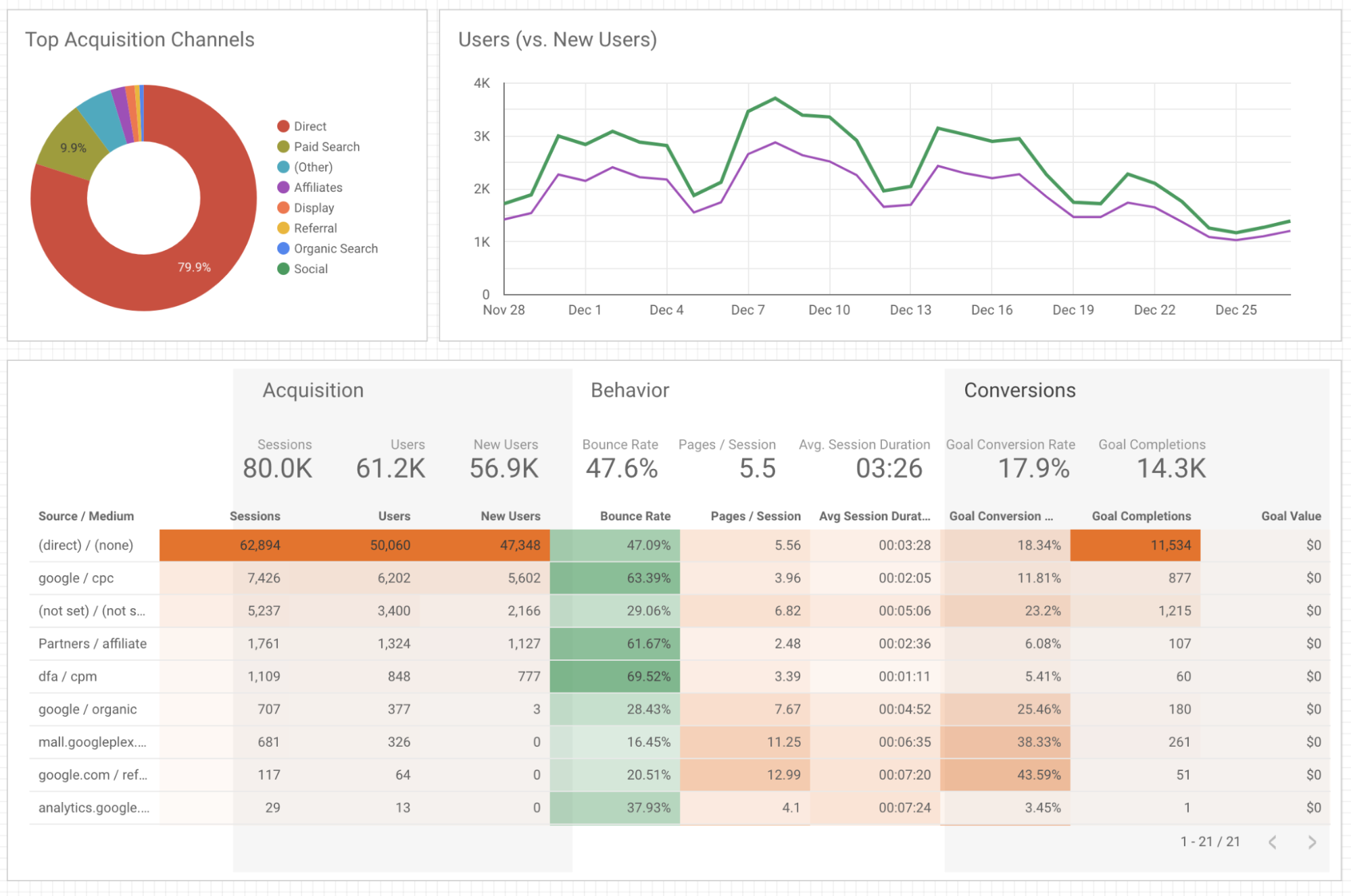 Picture was taken from the website https://datomni.com/blog/google-data-studio-101-hot-or-not/
- Using ready-made connectors to import data from different systems
There are many connectors that allow you to connect to the necessary data source in a few clicks. Google connectors are provided for most of the services that marketing specialists work with (Google Maps, Google Analytics, Google Sheets, Google Search Console, etc.).
You can visualize data from multiple sources on a single dashboard. In addition, it is possible to combine data from different systems. The merge function allows you to generate a report based on data from different sources. For example, in one table you can link data from Google Ads and Google Analytics, Google Spreadsheets and Google Search Console, etc. Data from one source can be combined with data from up to 4 other sources.
- The ability to select the appropriate data visualization
In order to make the information in the reports easier to perceive, it is important to choose the optimal form. Usually, data looks much more informative and understandable when they are presented not in the form of long tables, but as compact graphical diagrams. In addition, good visualization reduces the time needed to analyze a report and speeds up decision-making.
Here are the most common types of charts In the toolkit of Google Data Studio: line chart, area chart, histogram, cartogram, ring, circular, bar, bubble chart and others.
A great thing about Google Data Studio is that you can switch between charts and you don’t need to start from scratch.
By the way, not so long ago, Data Studio added the option to create tree maps. This is a convenient way to visualize a hierarchical structure, with which you can display quantitative values for each category by means of the size and color saturation of the area.
- Flexible management of data filtering and segmentation
Google Data Studio provides flexible data filtering capabilities. Using filters, you can set the necessary data selection criteria for a specific table/graph.
In this case, a filtering menu will appear on the report page, where you can select parameters for including/excluding data.
In addition to the standard options such as “Today”, “Yesterday”, “Last month”, “Last week” and others, you can select dates from the beginning of the current month or from the beginning of the quarter, and also specify whether or not it should take into account today’s statistics.
In addition, you can create your own filtering criteria by dates. For example, if you need to view the data for the time up to the day before yesterday, you can specify that in the advanced settings, too.
- Customize the design and style of the report for every taste
Thanks to the flexible capabilities of Google Data Studio, you can change the color scheme of report elements in your report as you wish.
Thus, you have the opportunity to observe the corporate identity in the elements of the charts. You can also add images to the report, for example, a logo or some brandbook elements.
- Extensive report access control capabilities
As in other Google products (Docs, Spreadsheets, Presentations), you can open access to the report in Data Studio. You can grant access via a link or send it to specific email addresses. It is also possible to download a report or arrange for it to be sent regularly by e-mail.
How to create a Report there?
 Photo by Lukas
1. Add a Data Source
Data sources can be added using a data connector. Create a new blank report and add a data source (for example, Google Analytics) in the panel.
First, add a “New Data Source” button in the panel and select Google Analytics. Then, create a “New Report” in the panel. Now, select a Connector for creating a new data source, and create a “New Data Source” in the panel and add that to your report. Now, click the “Authorize” option to authorize the connection between Data Studio and Google Analytics.
2. Add a Widget
Now, let’s focus on creating visualizations that can be added to your report. Some of the visualizations include: Pie Charts, Bar Charts, Time Series Graphs, Tables, Maps, Scorecards.
3. Customize the Widget
The metric and dimension can be modified the way you want. For example, you can add a comparison period, which allows you to compare your present data to the previous one. In the Date Range section, select “Auto” and click on the dropdown menu below it and choose the “Start Date” and “End Date”.
4. Create Your Report Theme
Whether your report is for clients, teams, or managers, it’ll be effective only if presented in the right way. To create your report style and formatting, click the “Theme and layout” option in the toolbar.
5. Embed External Content in Reports
With this feature, you can embed external files like Google Docs, Google Sheets, and even online videos to create the best experience for your clients. To add content, click “Insert” – “URL embed”. Now, a transparent frame appears on the screen. Resize and place the frame as required. On the properties panel, go to the “Data” tab, enter the desired URL in the external content URL field. Configure the chosen content’s frame border properties in the “Style” tab.
6. Share the Report
You can share or invite others to view or access reports and data sources. Also, by turning on link sharing, anyone in your organization can view your Data Studio assets, despite not having a Google account. So, you just have to select the “Share” button to let your customers or peers view or edit the reports.
Final Thoughts
If you haven’t used Data Studio yet, we hope that after reading this article you will be encouraged to test its capabilities. This product is constantly improving its functionality. Significant updates occur almost every month, and if you feel that right now some functions are lacking, chances are they may soon be implemented.
![Keyword Match Types in Google Ads [Ultimate Guide]](https://blog.promonavigator.com/wp-content/uploads/2021/04/match-types-600-360-1.jpg)