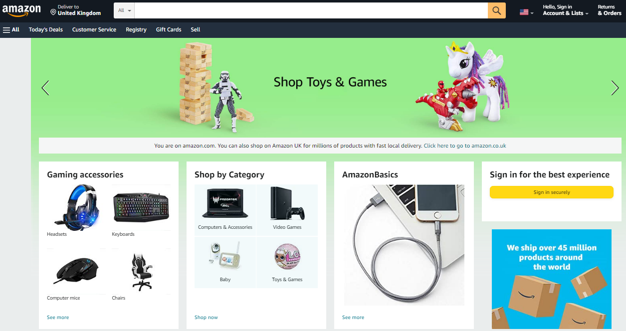
A professional, well-designed, and developed eCommerce site plays a crucial role in making a business profitable. Every successful business is known for its brand value, which it achieves through its unique and effective communication strategies with its target customers.
Experts from the Maxburst web designing agency have looked at dozens of sites to identify the principal elements needed to build a successful eCommerce site.
Here are ten tips that will help you create a great online store:
1. Makes Sure Your Site Is Easy to Navigate
The ease of navigation is one of the factors that determine if a website has a good design. It is important to have a home page that presents the key information in an organized manner. You should showcase the products that are of interest to the customers.
The navigation menu should be easy for the visitor to use and it should make it simple for them to travel through various other pages. To make your website easy to navigate:
- Use a Menu Bar. Menu bars are a great way to tell users exactly where they are on your site and what other pages are available.
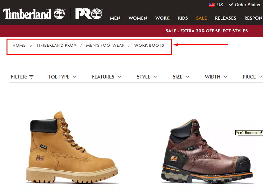
- Use Breadcrumbs. Breadcrumbs are navigation links that allow the visitor to see exactly where they are throughout their journey. They’re an excellent way of guiding people through a website and reducing confusion caused by deep levels of website navigation.
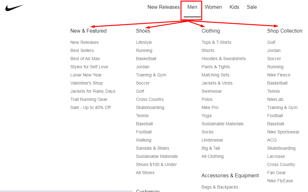
- Use Dropdown Menus. Dropdown menus are an excellent way of hiding more detailed, less relevant information from your visitors, keeping all important information upfront. This is especially important on mobile devices where there are often smaller screens available for viewing.
If you take the time to get it right, your customers will return and ultimately make purchases in the long run.
2. Use Social Media Icons
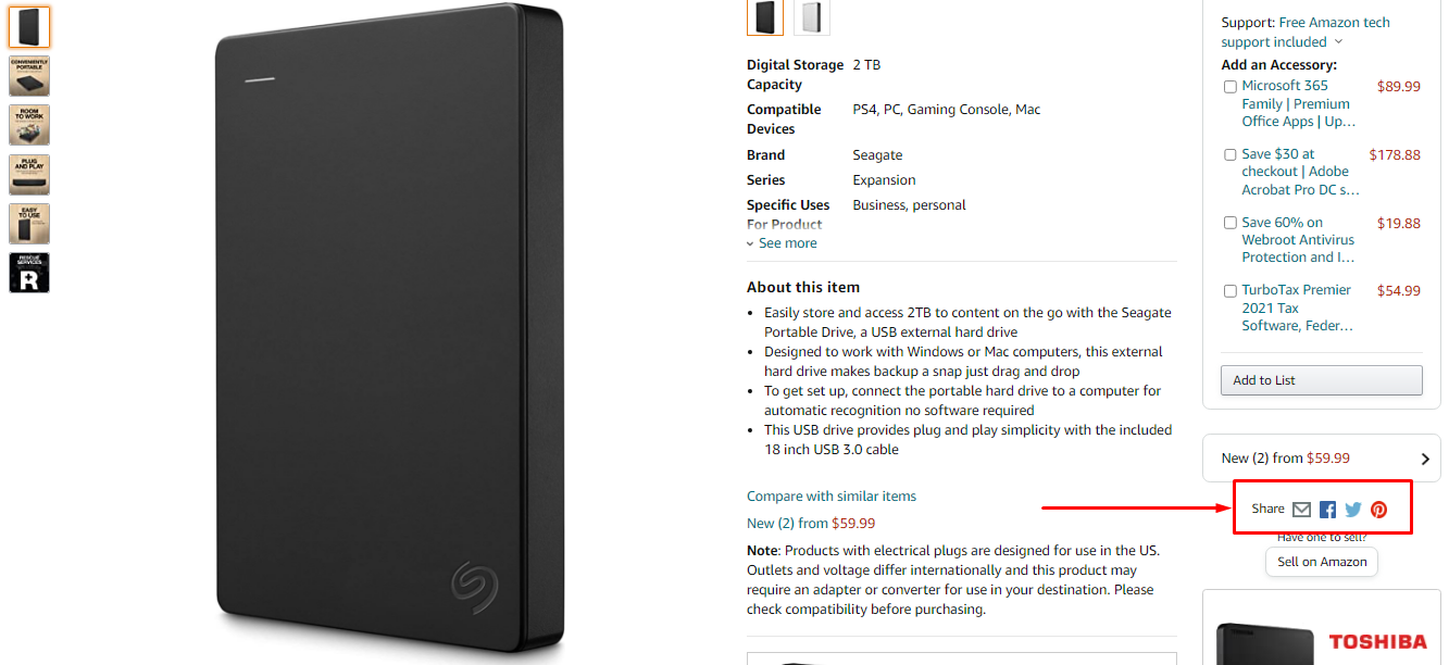
Social media icons are an integral part of any site these days. These tiny images can be used to improve the overall appeal of your website and give a much more professional look to your site.
Why add social media icons to your site?
- Social media icons give your website a personal touch and create a sense of community with your visitors.
- They help build your credibility. Whether you’re promoting a business or a blog, every visitor is looking for some proof that you know what you’re talking about and can be trusted with their information or money.
- Social media buttons are a great way to show that you’re an expert who is active in the online community.
- They increase the chances of visitors sharing your content on their own profiles and networks.
3 Ways to Create a Google Merchant Feed for Your Shopify Store
3. Use High-Quality Images
Product images are one of the most important aspects of eCommerce web design because they give potential customers an idea of what the product looks like and how they’ll use it. You should use high-quality images that are clear and sharp, especially if you want people to pin them on Pinterest or share them on social sites.
Screenshots from your site aren’t going to cut it when it comes to impressing shoppers with your inventory. Even if your products are high quality, shoppers have to see them and decide whether or not they’re right for their needs. This is were high-quality product images come into play.
Customers are more likely to buy if they can see the items they want before purchasing them.
4. Take Advantage of White Space
Layout with no white space usually makes your website look cluttered and messy. White space is important because it divides information into small chunks that are easier to digest than big chunks of information. When you put too much content on a single web page, users will often get lost and confused about what they should do next.
White space allows visitors’ eyes to move easily between the elements and encourages them to stay on the site longer. The more they visit, the more likely they are to make purchases.
5. Site Should Be Mobile-Friendly
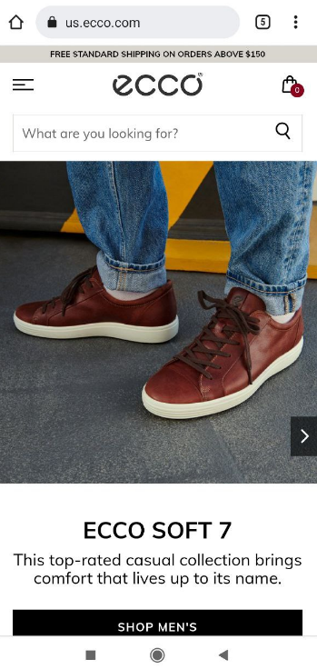
In the age of smartphones and tablets, a mobile-friendly eCommerce site is an absolute necessity. An increasing number of consumers use their phones to make purchases, especially while on the go.
You can make your site mobile friendly by:
- Use of bigger buttons and readable fonts
- Make it easy to read and navigate
- Minimize distractions and clutter
- Use a touch-friendly shopping cart
If your eCommerce site isn’t mobile-friendly, you’re losing potential sales to your competitors.
Optimizing websites for mobile viewing will pay off in the end.
6. Put Your Top Products at the Front or Center
People are busy. And people like to know what they’re getting before they make a purchase. That’s why your eCommerce store should show your best products/categories right on the home page.
You can also put one of your best products in the center of the page or use a carousel feature to rotate through multiple featured items. This is a great way to showcase new additions to your store and boost sales among repeat customers.
This tip is especially important if you sell a wide range of products with different price points, such as clothing, jewelry, or home goods. If you don’t provide any clues about which items are the most popular, customers might feel overwhelmed by their choices and not make a purchase.
7. Include a Lead Magnet
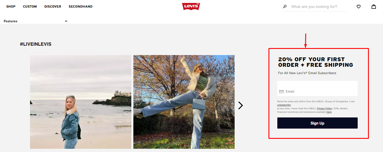
Lead Magnets can help you gather your potential customers’ emails and keep in touch with them. You can send emails to notify them of new products or even follow up with them.
As a lead magnet, you can use pop-ups to give away free stuff or discounts when someone signs up on the website. Giving away a free product sample or 10-20% discount on the first purchase isn’t too expensive, and it will get people to sign up for your newsletter, which may help them remember your website when they are ready to make a purchase.
8. SEO Practices
Website optimization is one of the most important aspects of online marketing, and it should be considered right from the beginning.
Site speed is crucial for your business. Google uses page speed as a ranking signal, and mobile users won’t wait more than 3 seconds for a page to load. Ensure you have everything optimized for performance and that nothing is blocking the loading time (like ads, widgets, or scripts).
Content is king, and this rule applies even more to eCommerce sites than regular websites. Make sure you prioritize content over graphics, don’t have huge paragraphs of text on one page, and keep your content short and relevant.
Good quality content will help you improve user experience, increase conversion rates and keep visitors coming back for more!
9. Add Upselling and Cross-selling Blocks
A customer can spend more money on your website than he has been planning initially. Of course, this works if you properly suggest related products or upgrades.
The first approach to increase your sales is adding cross-selling widgets. Cross-selling is encouraging customers to buy products related to the initial one. For example, if a customer adds a TV box to the cart, you can offer him/her to purchase a wall mount as well.
Cross-selling helps customers not to forget about significant items and lower his/her costs on delivery services. At the same time, cross-selling increases the average spend per customer and drives you an additional revenue.
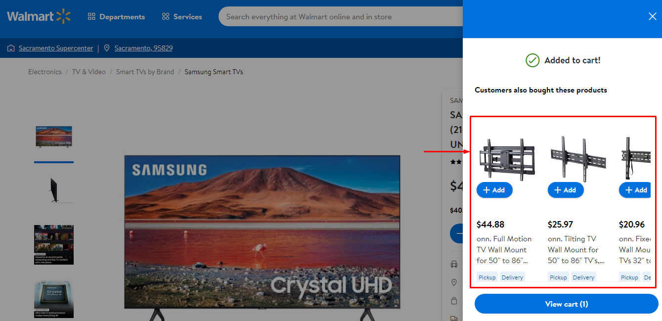 An example of the cross-selling block on the e-store website
Upselling is one more approach to increase your sales. The point is that you offer your customers an upgraded (extended) version of your product. These upgrades may include higher resolution, higher CPU frequency, additional options, etc. Such upgraded products cost higher, and you receive additional income.
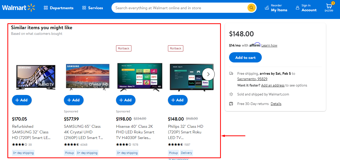 An example of the upselling widget on the e-store website
10. Keep a Simple Design
One of the most important things in website design for eCommerce is simplicity. You should not overwhelm your visitors with information, rather offer them just what they need.
The main purpose of your website is to sell your products or services and make money online. Therefore, it makes sense that you will present only those details that are necessary for your visitors to take action (to contact you or buy your product or service) without being distracted by other details such as “eye-candy” or fancy graphics.
Step Up Your eCommerce Game With These Tips
There are several strategies to enhance your eCommerce site. It would take a lifetime to try them all. But don’t let it stop you from trying them.
There is no secret recipe for a successful eCommerce business. These ten recommendations will help you start. It is advisable to examine your store’s strengths and limitations before embarking on a makeover. You may then enhance it by imagining how it should appear.
Promoting your Shopify store on Google is expensive and time-consuming? With the PromoNavi App for Shopify, you don’t need to waste time and overpay agencies for promoting your products—you just take a couple of minutes to set up a campaign, and you’ll start receiving customers right away.

