Intro: the essence of a call to action button and its importance for a successful Facebook ad campaign
Have you ever wondered how many times you have clicked on an ad on Facebook? The power of social media advertising is undeniable. Whether it is for a product launch, a seasonal promotion, or a brand awareness campaign, Facebook has become the go-to platform for businesses looking to reach their target audiences. A well-crafted and strategically placed CTA can help drive conversions and build brand loyalty.
The CTA button is an essential element of a successful Facebook ad campaign. It is an invitation to engage with a product or service, and encourages users to take the desired action. Whether you are an experienced marketer or a beginner, this article will provide you with the tips you need to make the most of your Facebook ad campaigns. We’ll discuss which CTAs to use for your marketing funnel and why these buttons work.
Best Call to Action Examples
Here are some of the best Facebook CTA examples to inspire your own marketing campaigns:
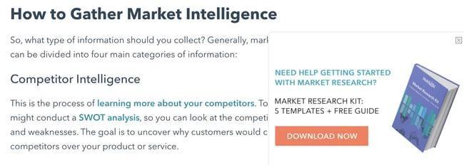
1. HubSpot
CTA: Download Now
Why it works
HubSpot knows that the best way to get customers engaged is to give them something for free to demonstrate its potential. This CTA provides a great example of how to offer customers value up front, as well as provide a great user experience. It’s a win-win for both the customer and the brand. This CTA creates a better user experience, and provides an excellent entry point for new customers.
How to replicate it
You should first identify what value your customers gain from your offer. With the right CTA, you can replicate HubSpot’s example and make it relevant to your business.
2. The Budgetnista
CTA: Sign Up for Weekly Goodies
Why it works
The Budgetnista is a one-stop shop for personal finance with comprehensive content. Instead of simply using a “Sign Up” CTA to promote your newsletter, it’s much better to speak the language that pushes the reader to click. “Sign Up For Weekly Goodies” sounds better than “Sign Up For My Newsletter.” This makes the CTAs inviting, and the content is easy to consume. https://dubaiescortstars.com
How to Replicate it
Budgetnista’s call to action reflects the owner’s personality, which helps tailor the interaction. Repeat the pattern and encourage visitors to take the desired action using friendly and creative language.
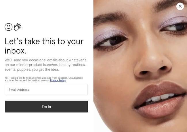
3. Glossier
CTA: I’m in
Why it works
Glossier is a beauty brand known for its modern website designs. It uses a strong CTA with an image of a model wearing the brand’s makeup as an overlay that appears while scrolling down a page. A clever and engaging phrase like “Let’s take this to your inbox” is an easy way to invite people to sign up for your newsletter. All you have to do is to click the “I’m in” button.
How to replicate it
Clever wording and phrases make your brand stand out and add an element of game that encourages customers to learn more. By creating strong visuals and intriguing phrases, you help your brand stand out from the competition.
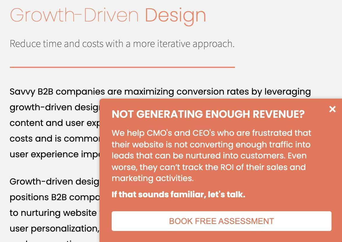
4. 310 Creative
CTA: Book Free Assessment
Why it works
It can be difficult for users to understand what services they might need. That’s why it has implemented a CTA that helps to eliminate any confusion. By having this CTA in place, 310 Creative can help site visitors find the best solutions for their business, and make sure that they are aware of the services they need to make sure their business succeeds.
How to replicate it
Because you understand how daunting it can be to take on a project without the help of a professional, offer free consultations. By offering this service for free you will remove any concerns that may be holding your clients back from getting the help they need.
5. VRBO
CTA: Discover your escape
Why it works
VRBO offers an impressive selection of luxury vacation homes with any amenities one could want. The company understands perfectly well that choosing a place to stay may well be a stressful task. The “Discover Your Escape” button invites guests to get closer to their dream destination. The CTA motivates readers to click and explore the options.
How to replicate it
Smart use of color and phrases can turn a passive user experience into an unforgettable journey. Try to create an inviting and exciting CTA that gives a user the confidence to take the plunge.
6. Hulu
CTA: Get The Disney Bundle
Why it works
Hulu dimmed the background to draw attention to the extensive library of television shows and movies, while the CTA in green and white highlights the promotion. A clever combination of registration and upsells gives viewers the opportunity to receive an additional discount when subscribing to Disney+ and ESPN+. Thus, Hulu capitalizes on both the new and existing customers and promotes its offerings at the same time.
How to replicate it
A package offer is a great way to entice visitors to take action because it gives them the impression that they are getting more value for their money. This type of message can be very effective in getting users to take action and sign up for the bundle.
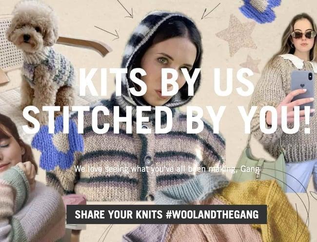
7. Wool and the Gang
CTA: Share Your Knits #woolandthegang
Why it works
With a powerful, CTA button “Share your knits #woolandthegang” the company encourages customers to share their work on social media, creating a unique user experience while also working as a brand promotion. The CTA encourages customers to share their knits with the hashtag #woolandthegang, making it easy to track customer works and creating a sense of community among the followers.
How to Replicate it
Creating a sense of community is an important part of any marketing campaign. So grab visitors’ attention and keep them engaged by creating a CTA that encourages users to join the community or become a part of something big. This approach is effective because it promotes your brand as more customers share their creatives.
8. Tweak It Studio
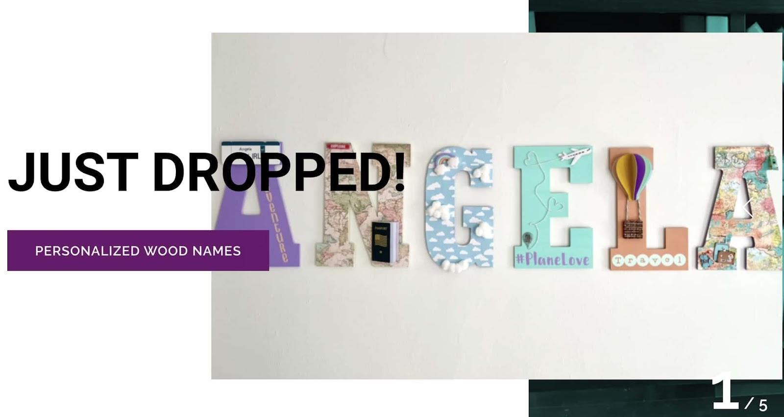
CTA: Personalized Wood Names
Why it works
Tweak It Studio understands that having fun with design and home decor is just as important as having clear CTAs. That’s why the brand has implemented a “Just Dropped” feature on its homepage to draw attention to the latest products, accompanied by a “Personalized Wood Names” button specific to the item. CTA gives the users an idea of what they are signing up for.
How to replicate it
Make sure the CTA is clear and concise, so that the visitors know exactly what to expect when they click the button. This will help ensure that your clients are motivated to take action, and that they understand the next step they must take. Additionally, you can add an incentive for users to take action now.
9. Prezi
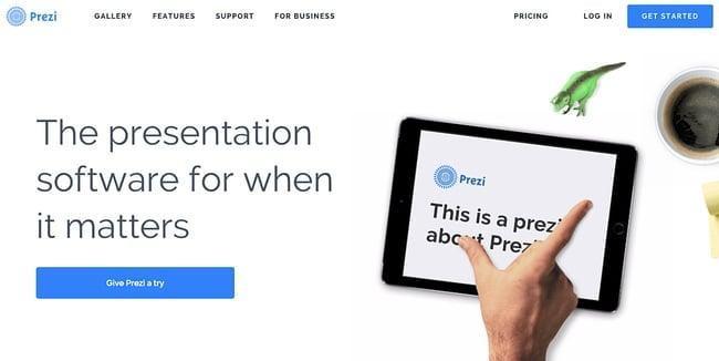
CTA: Give Prezi a try
Why it works
In a predominantly black and white color palette, the only highlight is the bright blue “Give Prezi a try” button, encouraging users to click on it. This streamlined design makes it easy to navigate the website and understand the product quickly without getting overwhelmed by too much information. It makes the user experience more efficient and enjoyable, focusing on the product rather than its presentation.
How to replicate it
Minimalist color scheme with two CTAs of the same color button is a great way to emphasize the importance of the action you want your visitors to take. Additionally, by using different text on each CTA, you can draw in users in different ways.
10. EPIC
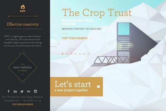
CTA: Let’s start a new project together
Why it works
The EPIC home page is interactive and allows you to browse each project. From the first visit, users are immediately amazed by the animation and video of the work in the carousel. The main call to action is highlighted and contains an inviting message “Let’s start a new project together.” This is a good signal to clients that EPIC is a great team to work with.
How to replicate it
Instead of generic phrases try something more specific to your service or product. This is more likely to grab someone’s attention and encourage them to take action. Use clear and concise language to communicate the benefit of clicking the button.
11. QuickSprout
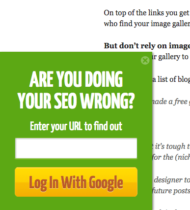
CTA: Are you doing your SEO wrong? Enter your URL to find out
Why it works
A mid-blog post CTA is an effective tactic for catching readers before they quit the page. QuickSprout’s CTA “Are you doing your SEO wrong?” invites visitors to find it out by entering their URL. This clickbait language is very enticing to users, as it prevents them from making a mistake.
How to replicate it
Your customers are looking for solutions to their problems. When the language you use in your CTA speaks to their pain points, you can grab their attention straightaway and suggest that your service is the remedy. Show that you understand their needs and can help.
12. Grey Goose
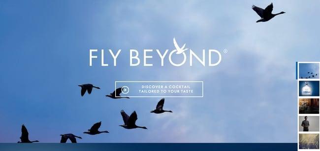
CTA: Discover a cocktail tailored to your taste
Why it works
A fun and unique CTA can be the crucial difference between a user who’s simply browsing or one that’s actually taking action. “Discover a Cocktail Tailored to Your Taste” CTA captures visitors’ attention and makes them want to click. A play button icon gives users a visual cue that they’ll be shown a video when they click the CTA.
How to replicate it
To make users feel valued and increase the chances of them returning, try implementing a CTA that suggests a customized product-based experience offer. A personalized experience helps your clients feel like they are getting the right product or service for their needs.
13. Brooks Running
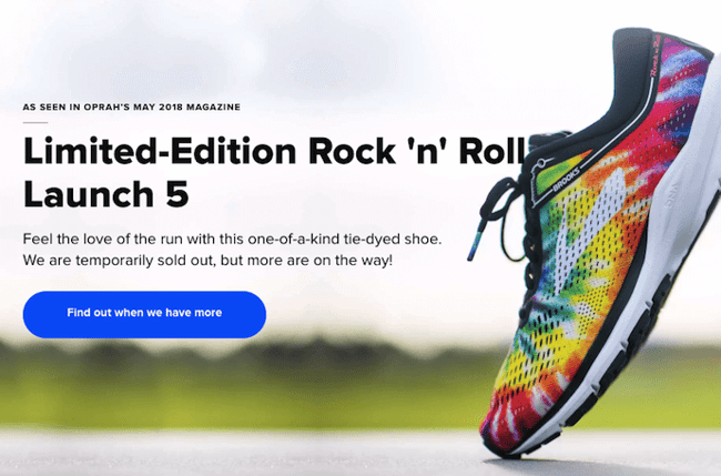
CTA: Find out when we have more
Why it works
Brooks Running understands how frustrating it can be when your favorite shoe is out of stock. That’s why they implemented a clever CTA “Find out when we have more” that directs visitors to a page which automatically alerts them when the shoe they want is available again. It’s an excellent way to keep customers engaged and informed about their products.
How to replicate it
Customers don’t like a page that informs them the product they’re looking for is out of stock. So, it’s important to add a CTA on the page informing users about the item’s availability. This is a great way to keep customers engaged and build a relationship with them even if their desired item is not yet available.
14. Humboldt County
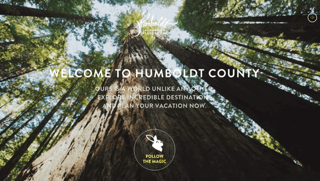
CTA: Follow the Magic
Why it works
Humboldt County’s website welcomes you with a mesmerizing full-screen video. Adding to the dream-like atmosphere, an unconventional CTA button in the bottom center of the screen features a bunny icon with “Follow the Magic”, suggesting you step into a fairytale. This encourages visitors to spend more time here and enjoy the immersive experience.
How to replicate it
Humboldt County is the perfect example of a visual CTA, inviting anyone to explore and discover something new. For travel companies and creative firms, amazing and intriguing CTAs should be a bait hook to lure users in and prompt them to explore the possibilities.
15. Madewell
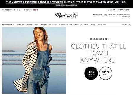
CTA: Take me there | What’s next?
Why it works
The Madewell website greets you with two options below “Yes, Take Me There” or “Hmm, What’s Next?” By selecting the first option, a visitor browses through clothing items that are perfect for traveling. By selecting the second option, a visitor goes to the next type of clothing offer. This gamification makes the browsing experience interactive.
How to replicate it
Gamification is an effective way to persuade visitors to explore your site further and discover what it has to offer. You can arrange a fun way to interact with your site that encourages them to explore further. Gamified experiences make the user journey memorable and ultimately lead to increased conversions.
Conclusion
Facebook has become one of the most powerful tools for businesses to reach their customers. With over 2 billion monthly active users, it’s no surprise that many businesses are turning to Facebook ads to get their message out. But, with so many businesses vying for the attention of users, it’s important to create ads that will stand out from the crowd. Facebook CTAs are an essential part of your marketing funnel.
Use the above examples and tips to start improving conversions for your Facebook ad campaigns and driving more revenue for your business today. By taking the time to study these examples and think about what works for each brand, you can start to create ads that will work for your own brand. With a little bit of creativity, you can create an amazing CTA that will help bring in new prospects and keep your existing customers engaged.
