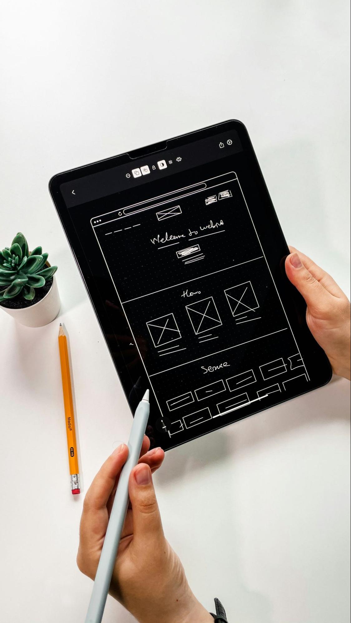
Introduction to the importance of mobile UX design to drive conversion rates
In today’s hyper-connected world, mobile users expect immediate results, effortless and intuitive experiences to efficiently achieve their objectives. Negative mobile experiences such as slow loading speeds, confusing layouts, and difficult navigation often frustrate users, leading to high bounce rates and missed revenue. Mobile UX optimization provides a viable solution. By improving mobile interactions, you can simplify the user experience, turning a frustrating experience into a smooth journey. Even small improvements can significantly increase user engagement and conversion, maximizing the impact of your mobile presence.
This article will cover the basic principles and practical techniques for optimizing mobile UX design. We will show you how to design a mobile experience that not only satisfies users, but also contributes to business success. You’ll learn how faster load times increase conversions by reducing friction. You’ll understand how clear, thumb-friendly navigation improves usability. You’ll explore optimized forms that reduce bounce rates. You’ll discover personalized experiences that keep users engaged.
Speed Up Load Times
 Photo by Faizur Rehman on Unsplash
Speed is paramount for the modern digital landscape. Research shows that even a single second delay in page load time can cut conversions by 20%, emphasizing the need for optimized performance. You should focus on strategies like image optimization, minimizing HTTP requests, and implementing effective caching. Mobile-first design is key, with a focus on simple designs that load quickly even on slow mobile networks.
Meeting user expectations for instant access requires a comprehensive optimization strategy that includes reducing server response times, using compression techniques, and minimizing unnecessary redirects. Lazy loading, which delays loading images and videos until needed, can also significantly improve performance. Regularly auditing third-party scripts is also vital to identify and address any performance bottlenecks.
Simplify Navigation
Mobile users interact with interfaces differently than desktop users, so they quickly become tired of complex menus and confusing navigation, leading to abandonment of the app or site. Mobile design should focus on simplicity and easy access. Clear navigation bars, sticky headers, and collapsible menus that hide less important options can greatly improve usability. Moreover, designing for thumb-friendly interaction with larger, well-spaced buttons and links helps prevent accidental clicks.
Streamlining mobile experiences also means prioritizing frequently used features while removing unnecessary options that overwhelm users. Predictive search suggestions are invaluable, minimizing input effort and guiding users effectively. Breadcrumbs are also important, providing context and enabling easy backtracking, resulting in a more intuitive and satisfying mobile experience.
Reduce Form Friction
Complex forms can be a major source of user frustration, often leading to drop-offs. However, a well-designed form can drastically improve the user experience. Features like autofill, dynamic fields, and visual progress indicators provide support and reduce the feeling of being overwhelmed. Breaking long forms into multi-step processes also makes them feel more manageable. Clear, specific error messages are crucial for guiding users to quickly fix mistakes and avoid the need to start over.
Beyond these core elements, thoughtful interface design makes a vital difference. Placing labels above fields improves readability and reduces confusion. Predictive text in drop-down menus speeds up data entry for common options. Offering login options with existing accounts, like Google or Apple, removes the barrier of new account creation. Tapping interactions instead of typing, particularly for selecting dates, locations, or predefined options, enhances usability, especially for mobile users.
Optimize for One-Handed Use
Most mobile users scroll with one hand. Interactive elements within reach of the thumb enhance interaction. The following interactive elements support natural hand movements:
- Floating action buttons
- Swipe gestures
- Adaptive layouts
With the rise of large-screen smartphones, single-handed usability has become a key consideration in interface design. Features like Apple’s “Reachability” and Android’s gesture navigation demonstrate adaptations to this trend. User engagement benefits from strategically positioning essential elements, like call-to-action buttons and main navigation, within thumb’s reach at the bottom of the screen. Additionally, sufficient spacing between interactive elements prevents accidental taps and contributes to a more fluid and intuitive one-handed experience. These factors show the importance of ergonomic design in contemporary mobile interfaces.
Implement Responsive Typography
Unreadable text makes users leave the site. So follow these guidelines to keep users on the site:
- Scale fonts, use proper line spacing, and use contrasting colors to improve readability.
- Adapt text sizes to screen sizes while maintaining eligibility without scaling.
- Use dark mode compatibility to improve nighttime viewing comfort.
Optimizing website performance and user experience hinges on strategic font choices and layout. Using system fonts leverages fonts already installed on visitors’ devices, avoiding extra downloads and dramatically speeding up load times. This creates a faster, more engaging experience. Thoughtful use of line height and paragraph spacing also enhances readability, making content easy to scan and digest. Clear visual hierarchy and generous white space further contribute to comfortable reading. Finally, adhering to Web Content Accessibility Guidelines (WCAG) for contrast ratios is essential for inclusivity. Ensuring sufficient contrast between text and backgrounds empowers users with visual impairments, making your website accessible to all.
Improve Call-to-Action Placement
Vague calls to action (CTAs) kill conversions. Potential customers need clear direction, and unclear CTAs lead to disengagement. To fix this, optimize your CTAs using key strategies. First, make them visually prominent with contrasting colors and bold fonts, and place them strategically, ideally above the fold. Sticky CTAs provide persistent visibility as users scroll. Crucially, continuously A/B test button design, color, and wording to discover winning combinations.
Beyond aesthetics, strong CTA language is essential. Use action-oriented phrases like “Get Started” or “Claim Offer” instead of ambiguous labels. Inject urgency with countdown timers or limited-time offers to encourage immediate action and leverage the fear of missing out (FOMO). By prioritizing clarity, visual impact, and compelling language, you can transform your CTAs into powerful conversion tools.
Minimize Intrusive Pop-Ups
Intrusive pop-ups can quickly drive visitors away from your website, harming your brand and increasing bounce rates. Fortunately, you can generate leads without sacrificing user experience. Consider less disruptive alternatives like exit-intent overlays, delayed pop-ups, or subtle banners. These methods capture attention without causing immediate frustration. Google also penalizes websites with overly aggressive pop-ups, reinforcing the need for a user-centric approach. Minimize annoyance and maximize engagement by implementing user-friendly designs, such as bottom-of-screen banners and clearly visible close buttons. Triggering pop-ups after a user has interacted with content, rather than immediately on arrival, creates a more positive experience that improves retention and increases the likelihood of conversion.
Enhance Personalization
Dynamic content is transforming user experiences by providing real-time personalization based on individual behavior and preferences. This leads to benefits like tailored recommendations based on browsing history, location-specific promotions, and predictive search suggestions that anticipate user needs and boost engagement. Advanced AI-powered UX improvements can even dynamically adjust website layouts and functionality, resulting in more intuitive and adaptive interfaces.
Beyond individualization, dynamic content offers location-based customization, automatically adapting currency, language, and regionally relevant content for a global audience. By incorporating recent browsing history, websites can offer highly relevant suggestions, driving conversion rates and enhancing overall user satisfaction. However, responsible implementation of data-driven personalization is vital. Balancing customization with data security and respecting privacy regulations is crucial for maintaining user trust.
Test and Iterate
To continuously improve performance and user satisfaction, a data-centric approach is vital. Techniques like A/B testing enable systematic comparisons of design elements (layouts, colors, and messaging) to identify optimal configurations. Furthermore, tools such as heatmaps and session recordings provide valuable insights into user behavior, pinpointing areas of engagement and potential difficulties. Ongoing updates are also necessary to keep the user experience and mobile optimization current with the latest trends and technologies. In addition to these methods, regular usability testing, both in controlled environments and real-world scenarios, is crucial for uncovering usability issues. Simulating realistic conditions, such as different lighting or network speeds, reveals challenges that might be missed in a lab setting. Finally, real-time analytics provide immediate feedback on user interactions, identifying problem areas and allowing for rapid adjustments.
Adapt to AI and Voice Search
The way people use mobile devices is being transformed by voice search and AI. Optimizing for natural language is now crucial, as voice commands become the preferred method over typing. Delivering quick, direct answers to voice searches improves accessibility and provides instant information. AI chatbots are also revolutionizing customer support, offering immediate assistance and faster response times, leading to happier users. Google’s focus on AI-powered search results that favor conversational queries highlights this change. Content creators can benefit by organizing information in a question-and-answer format to improve their visibility in voice search results. Voice-enabled features on mobile devices, like navigation and dictation, are simplifying user experiences and increasing accessibility for a wider audience, including people with disabilities.
Implement Accessibility Features
Designing for inclusivity goes beyond ethical responsibility; it’s a smart business strategy to broaden your audience. Features like screen reader compatibility, text-to-speech, and descriptive alt-text for images make your design accessible to users with visual impairments. Customizable font sizes and color contrast options cater to diverse needs and preferences. By adhering to Web Content Accessibility Guidelines (WCAG), we ensure our designs are accessible to people with disabilities, leading to a more equitable and positive user experience. Furthermore, incorporating haptic feedback and customizable interface layouts allows users to personalize the platform, resulting in greater engagement and satisfaction.
Conclusion
To maximize user satisfaction and conversions on mobile, businesses must prioritize UX optimization. This involves creating fast-loading, easy-to-navigate experiences with smooth interactions, enabling users to effortlessly achieve their goals, whether it’s making a purchase or signing up. But mobile optimization isn’t a one-time fix. It requires continuous adaptation based on user behavior and feedback, ensuring the mobile platform remains relevant and engaging. Looking ahead, incorporating accessibility features, AI-powered solutions, and design considerations for one-handed use are crucial for catering to diverse user needs and creating a truly positive and impactful mobile experience.


