You are scrolling through your Instagram feed and see a blogger wearing a dress you’ve dreamed of. Luckily, the brand is tagged in the photo. So You go to the brand’s Instagram page and find the dress you liked. You then go to the brand’s website through the ad and are immediately disappointed. You wanted to find out whether they had the dress in your size and how much it cost. Instead, you found yourself on the ‘about the brand’ page. Annoyed, you leave, having decided not to waste your time looking for the dress on the website.
This example page highlights the fact that poor destination page experiences can be for customers. In fact, according to a recent study by Meta, on average, landing pages scored less than 70 (out of 100) when evaluated against various heuristics.
This article will look closely at the research and its findings to identify solutions for optimising destination pages that make ads more efficient.
‘Stick the Landing’ Research
In partnership with Branding Brand, a mobile commerce consultancy, the Consumer Growth Consulting team at Meta has analyzed 500 ad-to-destination page experiences. Even though so-called ‘destination pages’ could be different, including homepages, product listing pages, and landing pages, they are the next step on a customer’s journey from the ad to the purchase and, therefore, were determined as the one for this survey.
Researchers ranked destination pages according to 13 weighted heuristics, including content, continuity, and call-to-action. On average, they received a 66% effectiveness score in the analysis. Such a relatively low score shows that businesses should improve their destination pages to increase their chances of engaging with and converting audiences.
During the research, Meta and Branding Brand identified key factors that make consumers’ experience on destination pages pleasant. Further, we will go through them and learn to implement the knowledge to create high-performing destination pages.
What Do Customers Want from Destination Pages?
Destination pages serve as a brand’s first point of contact with customers. It is the first page the customer sees after clicking on the ad. Often destination pages determine whether the customer converts or not.
In a recent survey, 80% said a business’s experience is as important as its product. Therefore, if the landing page is not easy to navigate, takes too long to load or does not answer a question from the ad, customers feel disappointed bythe brand. Luckily, it is easy to avoid. There are a few rules to follow to make the destination page seamless, like turning a page in a book.
First,remember to put yourself in your customer’s shoes l. After evaluating the mobile experiences from the customers’ perspective, Meta and Branding Brand concluded that customers want speed, answers to common questions and a mobile-friendly interface. This section will look at these factors through the customer’s eyes.
1. Increase loading speed
Over half of the shoppers will leave a site that takes longer than 3 seconds to load.
How do you feel when you tap on an ad that takes too long to load? Are you immediately frustrated and return to your feed? Or do you wait? How long are you willing to wait?
In general, the faster the destination page loads, the better. Everyone’s in a rush today. And if your competitors are faster than you are, you’ll lose your customers.
How to improve the site speed:
- Minimize HTTP requests.
- Improve time to First Contentful Paint (FCP).
- Deliver optimized assets.
- Defer loading out-of-view content.
- Remove unused third-party code.
2. Add answers to common questions
A survey by Emplifi found that 32% of consumers would stop doing business with a brand they love after just one negative experience.
Think of the last time you tapped on a Facebook ad. What did you want to see on the destination page? What did you want to know about the product, brand or the special offer mentioned in the ad? Did the page meet your expectations?
It would help if you were asking yourself all of these questions when creating a destination page. Look through the eyes of a newbie and try to answer all the common questions to interest the customer.
How to address common questions:
- Provide photos of products from different angles.
- Provide photos of products in lifestyle shots.
- Share relevant product details (dimensions, features, size, colour).
- Make sure your size charts are easily accessible on a mobile.
- Address any special value features that you’ve mentioned in the ad. For example, if you said that the product was ‘environmentally friendly’, include more information about it on the destination page.
- Provide details about featured promotions (e.g., ‘Buy 1 Get 1 Free,’ free shopping, etc.).
- Include prices, even if you sell services.
3. Create a mobile-friendly interface
On average, 85% of people globally now shop online. Moreover, people shop online on their phones more than on their laptops or tablets! 66% of Meta consumers said mobile was their most important shopping tool.
That’s good to know, meaning you should invest in mobile advertisement. However, it’s more important than ever to pay close attention to your site and how mobile-friendly it is. Mistakes will cost you customers. Nowadays, people know what to expect from websites; they know what works.
How to adapt a destination page to the mobile interface:
- Allow for white to make it comfortable for customers to scroll.
- Divide up long content sections and add headers to make it easier for customers to navigate.
- Design within reach of a thumb to ensure that shoppers can easily navigate mobile sites one-handed.
- Eliminate sticky elements (e.g., chat or promotions) on top of static elements.
- Be mindful of the limited space on the mobile version. Think carefully about when to show certain elements (for example, some parts could only be available on an upward scroll).
- Ensure that primary targets are easy to recognize and easy to tap. Often it’s reasonable to make call-to-action buttons the width of the page.
The 3 Cs of high-performing destination pages
The optimization of destination pages means fulfilling customer expectations. As determined by Meta, content, continuity, and call-to-action are the three proven factors consumers look for when they tap on an ad.
1. Content
Content is hugely important for the browsing experience. After consumers land on the right page, they decide whether to purchase what they are interested in or not.
- Include the product description with all the necessary details and multiple photos that show the product in action.
- Make sure the font is visible and easy to read, even on a mobile device.
- Use friendly language and avoid long sentences.
Check your website against Meta’s destination page content checklist:
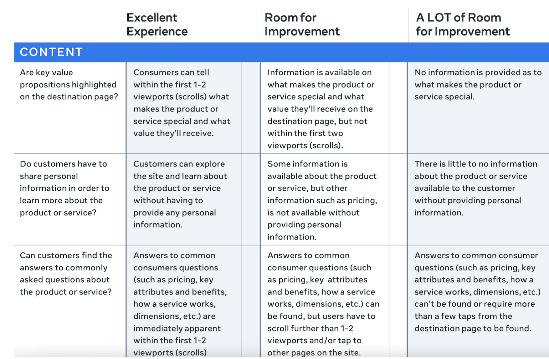 Image from Meta.
2. Continuity
The destination page should feel like a continuation of the ad! That means that all the promotions on the ad should be clearly reflected on the destination page. It also means that fonts, images, and aesthetics have to match.
It’s hard to align the destination pages with the ads when different marketing teams work separately on the products. Therefore, it is a good idea to connect those cross-functional teams first. Once the teams work together and communicate well, they can create different parts of the product that feel like one is the continuation of another.
Check your website against Meta’s destination page continuity checklist:
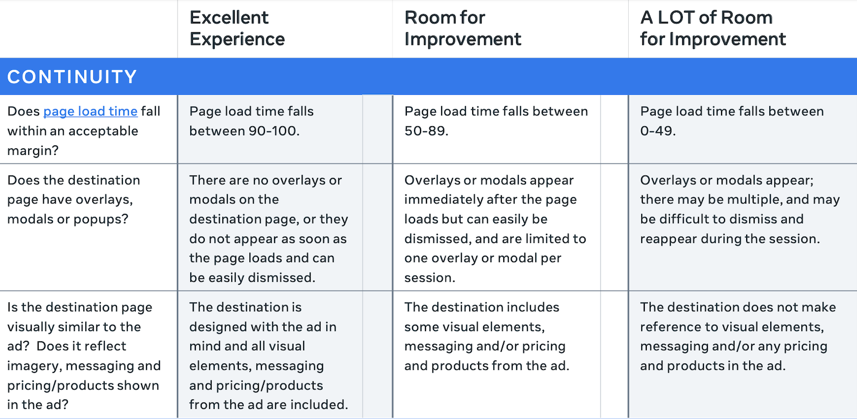 Image from Meta.
3. Call-to-action
A call-to-action button is essential on destination pages. Call-to-actions are essentially buttons that dictate the following steps; they could be ‘learn more’, ‘add to cart’ or ‘check out’ and so on. Making the next step as plain as possible for the consumer can dramatically improve conversion rates. Call-to-action buttons inspire progression, guiding customers towards purchasing your products.
Call-to-actions should span the entire screen width, appear as a tappable button, and follow customers as they scroll (see example). They should also be easily reachable while holding a phone with one hand.
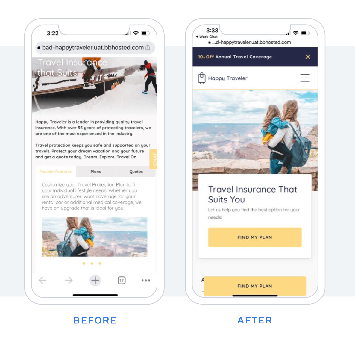 Image from Meta.
Check your website against Meta’s destination page call-to-action checklist:
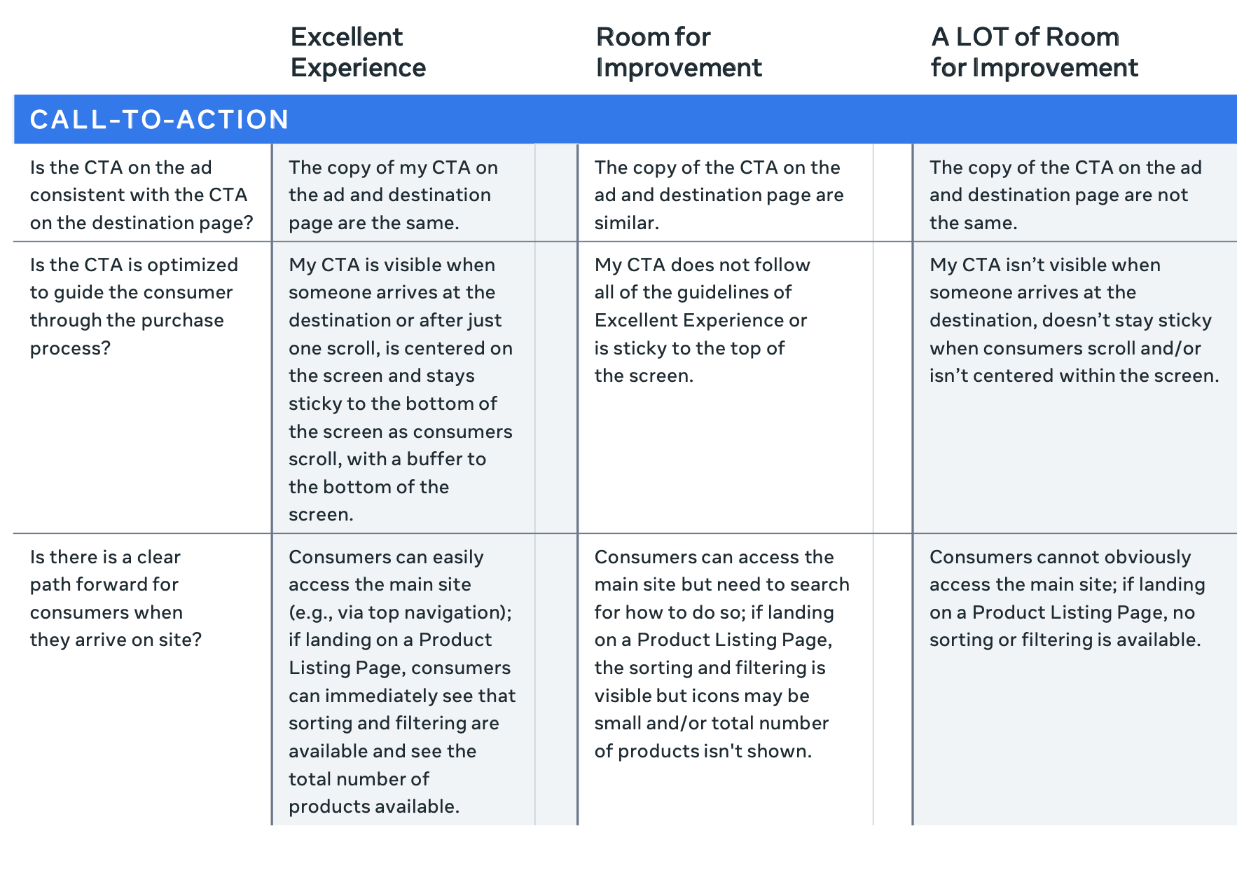 Image from Meta.
Test and learn
To conclude, in this article we have looked at the research by Meta and Branding Brand that evaluated destination pages, the pages where you land directly from the ad. The importance of destination pages cannot be stressed enough, as they are usually the decisive factor in whether or not a customer will purchase a product. Researchers have found that most destination pages weren’t what consumers had wanted. Have one more Look over the determined key factors that prove the success of destination pages and make sure to implement them all:
- Ensure your page loads in less than 3 seconds;
- Have continuity between the ad and the destination page;
- Identify your customers’ common questions and include answers on the destination page;
- Put yourself in your customers’ shoes;
- Design a mobile-friendly interface.
Finally, it is crucial for businesses to embrace a growth mindset and to learn constantly. And a big part of the learning would be testing your destination pages on real customers and redesigning the pages’ features if needed.
